Eurydice: Book Design
The goal of this project was to develop a fully fleshed out book of a classic or a story that uses text uniquely, so I chose the play Eurydice.
A play alone was considered a challenge, but Eurydice is difficult to even to play standards. The dialogue in it varies drastically between short phrases back and forth to long drawn out monologues, but the real beast was the stage directions. Which is where I focused my efforts.
The book consisted of many different pieces: the cover (which was a hand dyed muslin, navy cardstock and gold ink letterpress), the dust jacket, the end papers, and the interior pages (half title, full title, TOC, and four sets of interior spread, one starting a chapter and one ending it.)

The Dust Jacket
Making the Dust Jacket had a very similar start to a costume or a set design. I started by breaking the play down into themes and visuals that I found best fit, which for this case was water and concrete. The play has 1950s undertones so I went with a mix of Brutalist and Art Deco (because it felt right).
The concept was inspired by a Pinterest photo of oversized concrete stairs, which also has a part to play in the story. The biggest struggle with the dust jacket was getting the stairs to print right. They were made with a lot of transparencies and gradients, which the printer didn’t like. Otherwise things were straight forward.


Interiors
The goal of the interiors was to rethink how we read plays because I was getting sick of the formats of the plays I was reading for my theater classes.
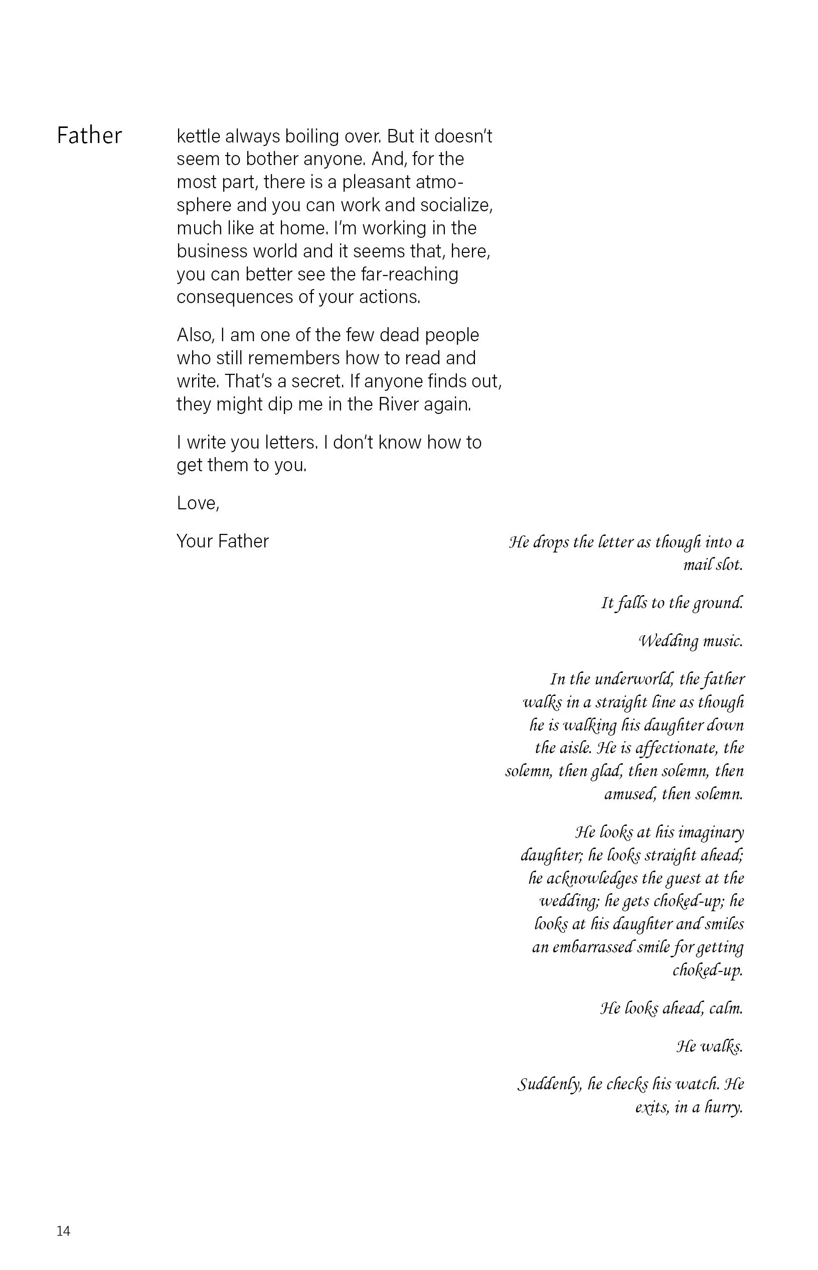
My main pet peeve with the modern play format is how inefficient the layout was, making plays so many more pages than they needed to be. I wanted to condense them a bit.
First round of drafting I was ambitious and was gravitating towards the two column method, with my personal favorite (still) being the second to the right, where conversational lines were split between two alignments, ideally helping the read though process. But it did neglect the stage directions and wasn’t a very flexible layout.
After reviews I settled on a less drastic two column style, having the stage directions be right aligned and the dialogue left. Simple concept, but with this play it wasn’t the case.